
Hi guys! Today I will explain how I came up with the idea of making NEGATIVE ART, and give you a walk through on how to make it yourself. Let's get started!
On my website, you can find 'Negative Art' in my gallery. Here's what they look like:
 |
 |
 |
|---|---|---|
But these are already the converted versions: this is what you see AFTER you apply the negative filter.
In short, what does it mean to apply a negative filter: everything that is dark becomes light, and vice versa. And all the colors are reversed into their respective complementary colors. Complementary colors are pairs of colors which, when combined or mixed (note: in light, not paint), cancel each other out.

The original is on the left here. As you can see, I've used mainly different shades of blue. There are two important questions here:
• Why did I choose to do it this way?
• How did I know what to do/ what colors to use?
It all started when I was browsing deviantart, and I came across some images that looked like this:

(Artwork by Xabi Wan, Pixielb and TwistedKatieKat)
Dark background, fiery highlights, obvious light source... All of them are (probably) made in Photoshop or similar programs. I really like this type of art, but since I wanted to stick to traditional art methods, I ran into some problems:
• I was not fluent in Photoshop (-yet!)
• My first instinct was: "I guess I can do it on a black canvas?" But I quickly realized:
• My paint is not bright enough...
• And even if it was, it's definitely not opaque enough (I figured my colors would just kind of disappear into the dark background).
I was in a creative mood, and I thought, okay.. My biggest problem is the black background. I only have white paper/canvases.. And to just leave the background white will take away the intensity of the light parts of the image.. What can I do.. To make bright colors on black paper, while only having dull colors and white paper...
I remembered that negative filters turns white into black, and black into white. Could this solve the 'black background issue' I was having?
At the time, I was in the possession of a Huawei Ascend P7. This phone was released in June 2014, and it still had a negative filter option among the standard camera filters (oh, the good old days...). I used the camera's negative filter and filmed the screen of my computer. This is what I saw:

The ever so complicated black background disappeared before my eyes!
I browsed the interwebs, looking for a free, online photo editor that could apply a negative filter to my images, and I stumbled upon a very cool website: LUNAPIC (this website is great for many other things too, go check it out!).
I converted an image, and created this interesting situation:

I immediately realized that painting the negative versions of these kind of images might be way easier!
• You don't have to bother painting the whole canvas black.
• The skin color seemed easier to make than real, human, skin color.
• Often when painting on white, you have a risk of using a color that is too dark. You can't really erase such a mistake, because putting white on top of black doesn't help. In this case, white becomes black, and black becomes white. So when you have something that is too dark (in negative), you can just add a darker color (in original) and the area will be lighter!
Since most cameras on phones these days don't have the negative filter anymore, you will probably have to download an app for it. The one I am currently using is simply called Negative Image. I'm not sure if it's available for iOS.
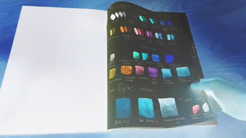
Back to my adventure: I keep a colorbook, where I test all my paint. It is VERY satisfying to use different pages to capture how the colors of different brands behave and what they look like. These are a few pages of my colorbook:
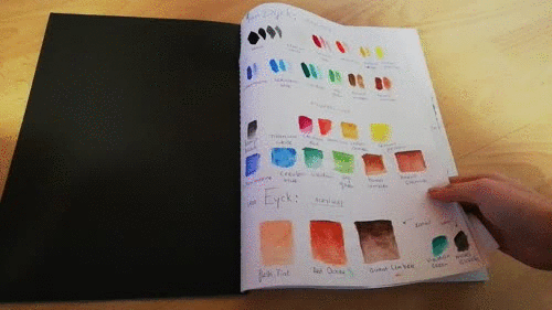
When I looked at it through the Negative Filter on my camera, it looked like this:
I got my paint tubes from the attic and filmed it.. For the images I wanted to paint, I knew I needed blue shades; these would be reddish in the 'negative world'.
These were my tubes of paint how I knew them...

...And this is what they looked like through the filter.

Who else notices a big problem????!!!!
Where are the RED colors? We need a lot of red in those paintings, so... Where are they, in the "negative world"?? Intuitively, I thought the blue tubes would turn red (indicated with the red arrows). But none of them were really red in negative...
I found a somewhat creative solution: I went to an art store, got my camera out, and started seeing all the paint they were selling through my negative lens...
Here are the shelves...

...And here they are in negative:

Can you spot it ?! :)

Oh, yes. This is the one !!!
It's REALLY the best color to have when painting in negative guys, it's the Turquoise Green, number 661 from the Amsterdam Standard Series. You can buy it almost everywhere, to find a store in your neighborhood, click here.
So, that is everything.
1) Find a picture you want to make
2) Use a website like Lunapic to apply a negative filter for it
3) Have both the original and the inverted image as reference when painting
4) Use your phone (with an app that has a negative filter) to continuously check what you're doing
With all that in mind, I think you're good to go!
I hope you learned something from this post, and I hope to see people use this style in the future. I once made a T i m e L a p s e (speedpainting) video of me making a negative painting, it's not my best work, but feel free to watch it !
I have never seen anyone use regular paint this way, and when I look for "negative art" on the Internet, nothing like this shows up. I might have invented a new form of art !!! (If anyone has seen this technique before, let me know in the comments!) At least the video proves that I've been doing this since 2016...